e-Commerce Website Refeições Leves
Project Context
This was a team project during the Ironhack UX/UI Design Bootcamp, where we had seven days in class and two extra over the weekend to work on it. The challenge was to design a responsive website for a local business or professional, improving their online presence and making it more functional for both customers and stakeholders
Many small businesses still lack an effective digital presence. Even when they have a website, it's often just a basic page that doesn’t truly meet their needs. For this project, we worked on an existing solution, analyzing what worked and what could be improved to make it more intuitive and user-friendly.
Team: Ana, Railene and Myself
Time frame: 5 weeks.
My role: UX/UI Designer
Target device: Desktop and mobile
The Client
Refeições Leves, is a small homemade healthy food business in Portugal that uses fresh, seasonal ingredients. The founder, Karla, already had a website, but it wasn’t intuitive or efficient for users. Our task was to analyze the existing solution and improve it, making navigation smoother and the ordering experience more seamless.
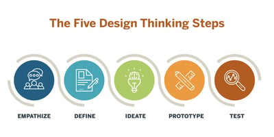
We needed to improve the overall experience for customers when using the website and make sure the platform was fully responsive. To do that, we followed the five steps of design thinking to guide our process and create a user-centered solution. We started by looking into the issue, interviewing users who had interacted with the existing website to understand their struggles. Then, we defined the main problem, which helped us come up with potential solutions. From there, we brainstormed different ideas, created simple prototypes to test them, and refined our approach based on feedback. This process allowed us to break the problem down step by step and come up with a more effective solution.
The Problem
Stakeholder Interview
The purpose of the stakeholder interview was to start to empathize and understand the project goals, identify potential challenges, gather insights , requirements, and align the team's efforts with stakeholders expectations.
❝The packaging is reusable and we recycle and compost everything in the kitchen.❞
❝Provide confrontation in the daily lives of the people I serve, less waste and environmental impact.❞
❝Most of my clients are referred to by other clients. Some arrive via Instagram and the website.❞
❝Avoid buying anything that has packaging, things that are sold in boxes. Recycles, separates waste and has a composter. Always indicate to customers where to dispose of packaging.❞
Competitive Analysis
This step is about evaluating and comparing websites and the digital presence of similar local businesses or professionals to identify strengths, weaknesses, and opportunities for improvement.
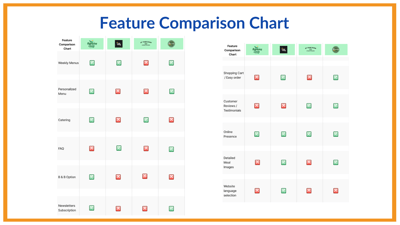
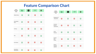
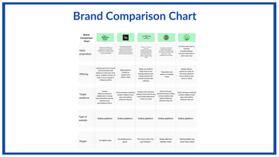
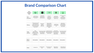
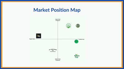
To do so, we chose the following business competitors: Eat Tasty, At Your Door, The Revolution Food, and Dona Marmita and made a Feature Comparison Chart to understand what features are more common or what might be missing, a Brand Comparison Chart to understand our competitors' values and offers, and a Market Position Map to identify where there is space to stand out.
With the Feature Comparison Chart, we identified five features that could be included to make our business more appealing and effective: FAQs, Shopping Cart, Customer Reviews/Testimonials, Detailed Meal Images, and Website Language Selection.
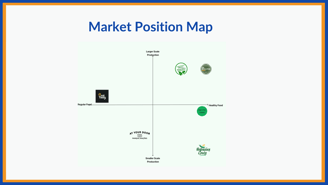
The Market Position Map helped us analyze how our client is positioned in relation to its competitors. We used two key axes: Regular Food vs. Healthy Food and Larger-Scale Production vs. Smaller-Scale Production. Our client falls into the Healthy Food & Smaller-Scale Production quadrant, meaning their focus is on fresh, homemade-style meals rather than mass production.
The Brand Comparison Chart helped us see how our brand compares against competitors. It shows things like offerings, type of website, slogan, target audience, and how people perceive us. This helps us understand where we stand in the market and where we can improve.
From this analysis, we identified an opportunity: moving slightly towards mid-scale production would place the business in a more competitive position while still maintaining its commitment to quality. This would allow them to reach a broader audience without compromising their core values.
Our client's main goal was to attract more customers and achieve modest growth while maintaining the high-quality standards they are known for. While they were open to expanding, preserving the quality of their meals remained a priority. They also needed to manage costs efficiently, as they operate with a smaller team. Taking these factors into account, we implemented strategic improvements that aligned with both market expectations and the client’s business goals, ensuring a more competitive and user-friendly website.
User Interviews & Usability Test
We conducted user interviews and usability testing with the existing website to better understand the user experience and gather valuable feedback. Through these sessions, we gained insights into how users interacted with the website, what they found frustrating, and what features they desired. This allowed us to identify areas for improvement and inform our design decisions moving forward. By listening to the needs and preferences of our users, we were able to create a more intuitive and user-friendly experience for our audience.
Main issues identified:
Difficulty navigating the menu
Lack of detailed meal images
Unintuitive ordering process
❝I look for a healthy meal delivery service for its quality and due to lack of time to prepare meals.❞ E.G.
❝I would like more to see each plate individually better explained with their name.❞ O.E.
❝I had difficulty finding the menu option.❞ E.G.
Affinity Diagram & Empathy Map
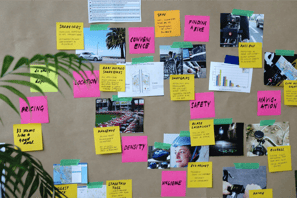
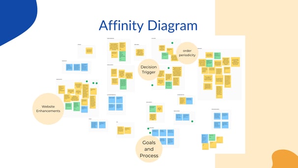
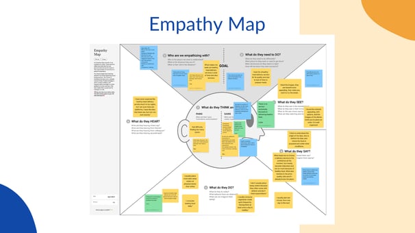
Now was the time to organize all the insights from our users. We did so with the help of two tools: Affinity Diagram and Empathy Map. With the first we grouped the insights into categories like “website enhancements”, “decision triggers”, “order periodicity”and “goals and process”. And with the second we organized the insights to understand what users see, do, think, and feel, all this helps to create the User Persona.
User Persona & User Journey Map
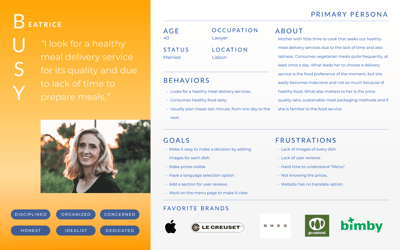
With all the insights gathered, we defined our User Persona: Meet Busy Beatrice, a dedicated lawyer and mother living in Lisbon. With a fast-paced lifestyle, she seeks a convenient and high-quality meal delivery service that saves her time without compromising on nutrition.
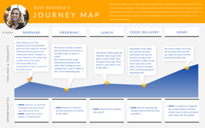
To further empathize with our users, we mapped out Busy Beatrice’s journey. Her mornings are rushed, often leading to unhealthy, on-the-go meals. However, with a pre-ordered meal delivery service, she can conveniently solve dinner without stress, improving her overall routine and well-being.
Problem Statement & HMW | How Might We Statements
After gathering insights, we moved on to the Define stage and formulated our Problem Statement:
Busy individuals who follow a healthy diet need a way to easily access weekly homemade meal deliveries because they lack time to prepare and plan meals and struggle to find clear information about their options.
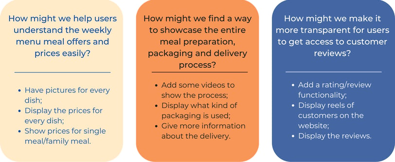
With this in mind, we developed How Might We (HMW) Statements to guide our solution:
By simplifying menus, showcasing the meal preparation process from kitchen to delivery, and highlighting user reviews, we can build trust and create a seamless meal delivery experience for Busy Beatrice.
MoSCoW Method & MVP | Minimum Viable Product Statement
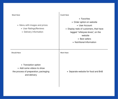
To define priorities effectively, we used the MoSCoW Method, a technique that classifies features based on their necessity. This approach allowed us to focus on core functionalities, ensuring that key elements such as menus, user ratings, and delivery information were prioritized. At the same time, we considered improvements like enhanced navigation and order tracking, while identifying future possibilities such as language translation options and social media integration.
These priorities shaped our Minimum Viable Product (MVP), ensuring that the platform delivers value while allowing room for future enhancements.
The Minimum Viable Product (MVP) for Refeições Leves was designed to provide healthy homemade delivery food with a personalized offer for dietary restrictions. However, we observed that the website is not effectively meeting user needs. It lacks a clear presentation of the menu, including matching pictures, prices, reviews, and delivery details. These issues create difficulties in user interaction, making them less likely to engage with our services and potentially leading to order losses for the business.
Site Map & User Flow
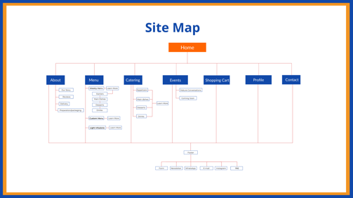
To create a smooth navigation experience, we structured the website into key sections: Homepage, Menu, Catering, Events, Shopping Cart, Profile, and Contact. This ensures that users can easily find what they need without unnecessary complexity.
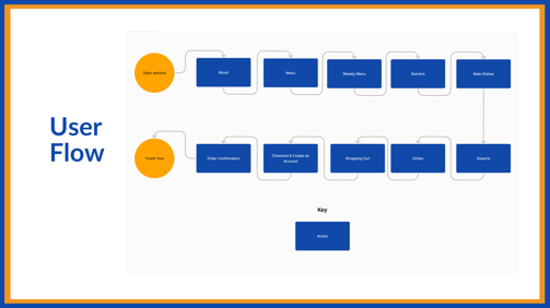
For the User Flow, we designed an intuitive Happy Path, guiding users seamlessly from browsing the menu to placing an order. This approach minimizes friction and enhances the overall experience.
Concept Sketches
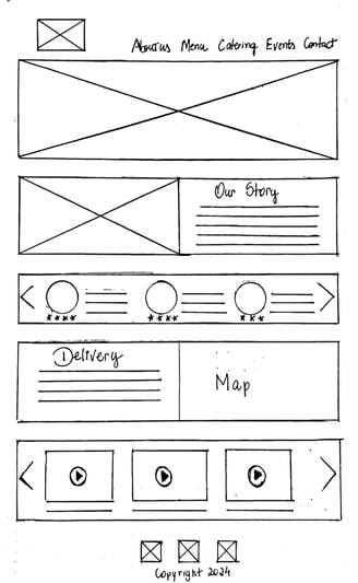
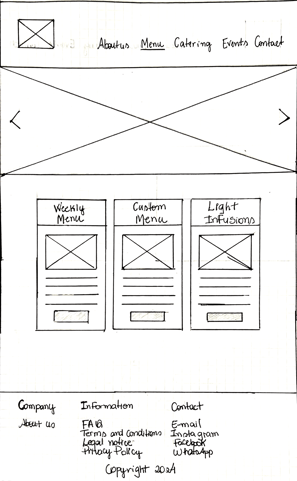
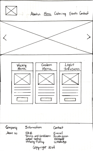
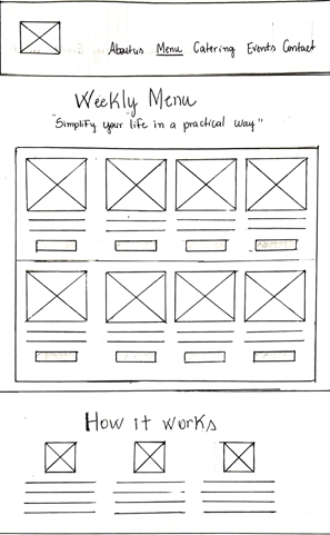
At this stage, we started ideating and exploring different approaches to improve the website. We sketched out possible solutions to refine the user experience and address the main usability issues identified during research.
Low-fidelity Wireframes
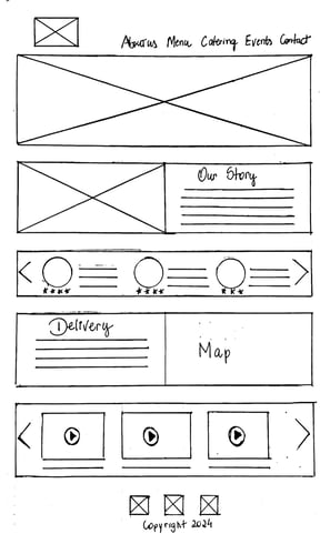
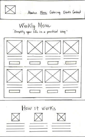
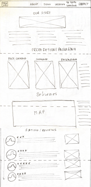
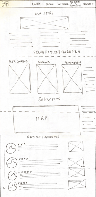
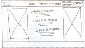
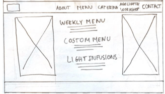
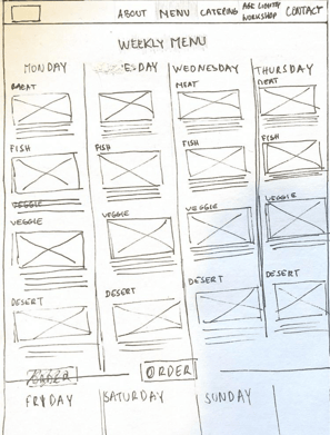
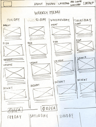
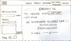
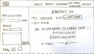
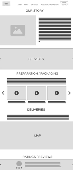
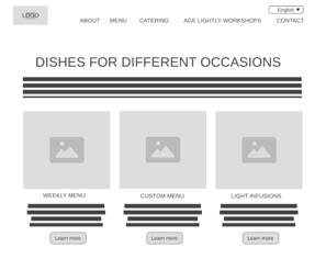
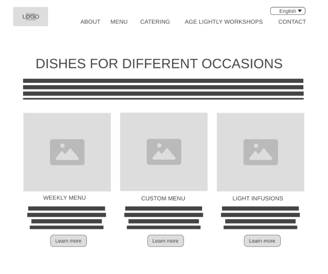
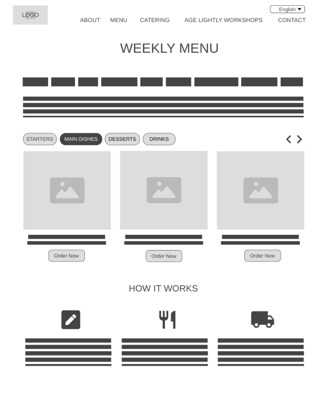
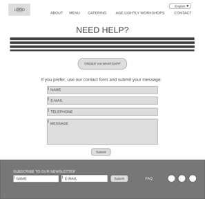
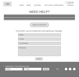
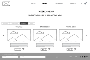
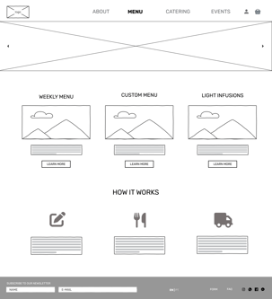
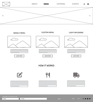
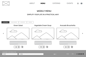
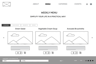
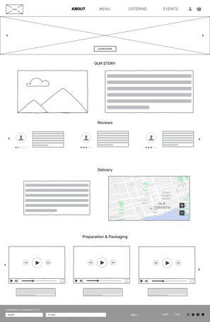
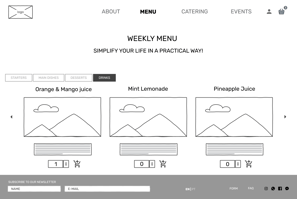
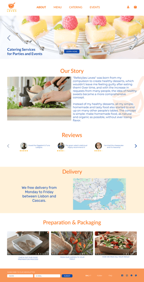
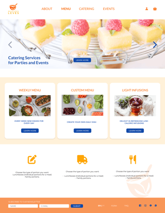
After Ideating, we moved on to Prototyping, merging our ideas into a more structured solution. The homepage introduces the business story, customer reviews, and delivery/package details, ensuring users quickly understand what the service offers. The menu page was designed to present different meal options using cards, allowing users to choose between the weekly menu, custom menu, or light infusions in an intuitive way. To make browsing easier, the weekly menu page organizes meals into categories, improving navigation. Finally, the contact page provides a seamless experience, enabling users to reach out through a form or place an order directly via WhatsApp.

Mid-fidelity Wireframes & Usability Testing
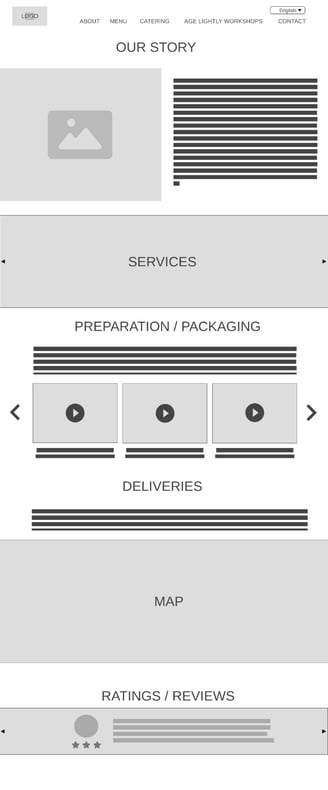
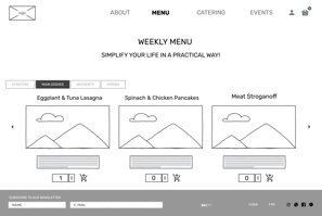
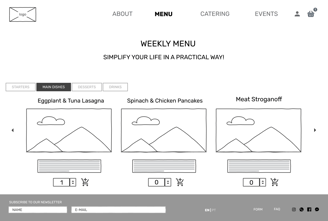
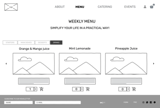
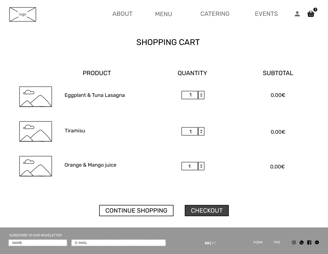
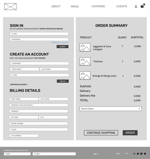
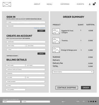
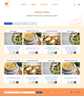
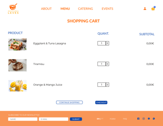
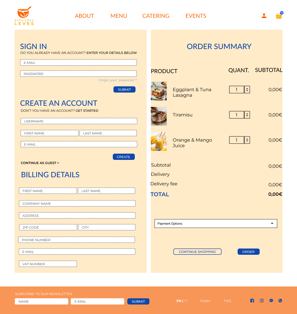
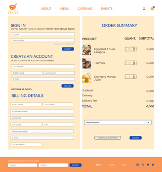
We continued evolving our ideas and built mid-fidelity wireframes. At this stage, we mostly maintained the homepage structure and menu page but redesigned the weekly menu, replacing the slideshow with a full-page display of meal options for better visibility. We also aimed to enhance the website by implementing a shopping cart functionality and streamlining the ordering process, merging user registration and order summary into a single page for a more seamless experience.




Visual Competitive Analysis
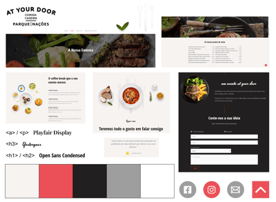
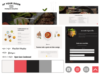
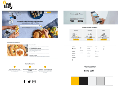
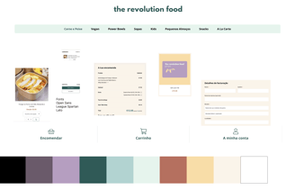
To further empathize with users, we conducted a Visual Competitive Analysis, looking at three competitors in our market space: Eat Tasty, At Your Door, and The Revolution Food. This helped us understand how their websites are designed, what visual elements they prioritize, and how they communicate their brand identity. More importantly, it allowed us to define how we wanted our product to stand out, ensuring a distinct and engaging visual identity that reinforces our brand values.


Brand Attributes & Moodboard
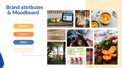
To define a strong and unique brand identity, we established "Friendly," "Healthy," "Fresh," and "Time-saving" as our core values. These attributes guided our design decisions and shaped the overall tone of the project.
When creating our moodboard, we used it as a research tool to visually explore and reinforce the brand’s personality, ensuring consistency in how we communicate its essence through design.

Style Tile
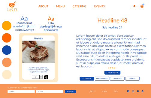
In the style tile, we established the key colors, fonts, and interface elements that define our brand’s visual identity. Our orange and blue color scheme was inspired by the moodboard, reinforcing attributes such as friendliness, fun, and an uplifting feel.
For typography, we selected Lato and Montserrat due to their clarity, simplicity, and readability across different screens, ensuring a clean and modern aesthetic.

High-fidelity Wireframes
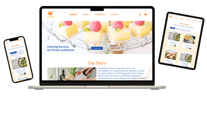
Building upon the Style Tile, we had a preliminary vision of how these elements would work together. We then translated these ideas into high-fidelity wireframes, bringing the visual identity to life while preserving the structure established in the mid-fidelity stage.




Refining the Design Based on Testing
After gathering insights from usability testing, we made key improvements to enhance the ordering experience. The weekly menu, initially presented as a slideshow, was redesigned to display all meal options on a single page for better visibility. We also refined the shopping cart functionality, ensuring clearer feedback when items were added. Additionally, we streamlined the order summary and registration process by merging them into a single page, making checkout faster and more intuitive.
Hi-Fidelity Prototype
Now, Busy Beatrice takes us through the high-fidelity prototype, starting from the main landing page and guiding us through the process of placing an order from the available weekly menu options.

Conclusion & Learnings
Throughout this project, we gained valuable insights that shaped our design decisions and highlighted key aspects for improvement.
We learned that menu clarity and meal images play a crucial role in user engagement, as they directly impact how easily users can explore meal options. Additionally, the ordering process needs to be quick and intuitive, minimizing friction and ensuring a seamless experience. Even small structural adjustments can significantly enhance usability, making the platform more accessible and efficient.
If we had more time, we would conduct further usability testing with a larger group of users to refine the final design, ensuring that all improvements align with real user needs and expectations.
