Designing a Sleep-Enhancing Wellness App for iOS
An UX/UI Design project for an IOS Native App

Project Context
Team: Olga and Myself
Time frame: 5 weeks.
My role: UX/UI Designer
Target device: Desktop and mobile
This was a team project during the Ironhack UX/UI Design Bootcamp, where we had eight days in class and an extra weekend to refine our work. Technology is driving significant changes in the health and wellness industry. The widespread use of smartphones has created a massive market for mobile health apps, wearables, and biometric trackers. As a result, digital healthcare products are gaining popularity.
The Client
The Daily Health Conference is a non-profit organization dedicated to promoting health and wellness through impactful public talks, interactive workshops, and professional training worldwide. Founded in 1983 in San Francisco as an event where Medicine, Health, and Wellness intersected, the conference now covers a wide range of health-related topics—from nutrition and sleep to addiction—in over 100 languages.
The organization offers an online membership on their website. However, despite its extensive experience in the field, The Daily Health Conference has struggled to keep up with technological advancements, leading to a significant drop in memberships.


The Problem
The Daily Health Conference is eager to explore how technology can help people lead healthier lives.
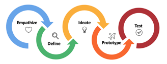
While brainstorming potential features for the app, the team realized the opportunities were virtually limitless. The app could help users track diet plans, fitness programs, mental wellness, stress levels, water intake, and more. With so many options available, they weren’t sure where to start. To address this, we applied the 5 Steps of Design Thinking to guide our process.

Requirements:
The Daily Health Conference wants designers to rethink how people can adopt and commit to a health-improving routine.
The app can address any aspect of personal well-being, including (but not limited to): medicine, fitness, nutrition, meditation, time management, and so on
The app should monitors the users’ progress and encourages them to adopt a healthier lifestyle
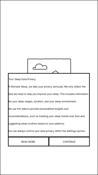
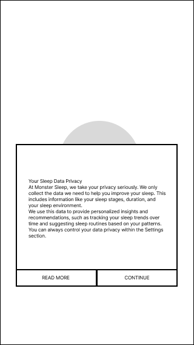
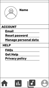
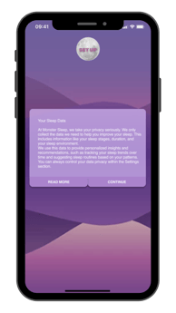
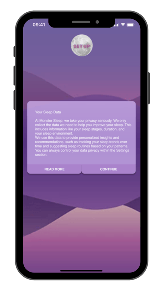
Users must retain control over their personal data (GDPR Compliance)
The user interface should reflect a new, fresh, updated image aligned with the Daily Health Conference values.
Secondary Research
To better understand the topic, we conducted secondary research to gather insights.
Existing Apps
Sleep Monitor
Sleep Sounds
Calm – Sleep, meditate, relax.
Studies
Various studies worldwide have shown that insomnia affects between 10% and 30% of the population, with some reports indicating prevalence rates as high as 50% to 60%. Insomnia is more common in older adults, women, and individuals with medical or mental health issues.
Read more on NIH's website.
Circadian Rhythms
Circadian rhythms, which are the body’s natural sleep-wake cycles, play a significant role in regulating sleep patterns.
Learn more about circadian rhythms.
Competitive Analysis
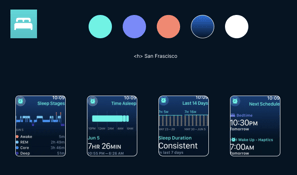
This step focused on understanding the competitive landscape of sleep apps by evaluating their features and identifying key opportunities for differentiation and improvement.
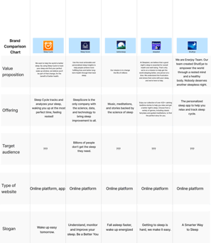
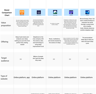
We analyzed five leading sleep apps: Sleep Cycle, Sleep Score, BetterSleep, Sleepiest, and ShutEye. Through this analysis, we identified common features, gaps, and areas where a future sleep app could stand out.
Through the Brand Comparison Chart, we observed that all the apps have a common goal: improving users' sleep quality and overall well-being. However, we identified an opportunity to differentiate a future sleep app by emphasizing a more holistic approach to well-being, including aspects like mental health and relaxation techniques, which are often underrepresented in other apps.
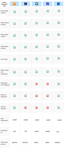
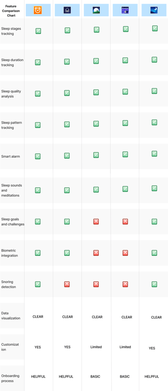
Through the Feature Comparison Chart, we identified that essential features like Sleep Stages Tracking, Sleep Duration Tracking, Sleep Quality Analysis, and Sleep Pattern Tracking are crucial for a good sleep app. Additionally, features such as Sleep Sounds and Meditations, Sleep Goals and Challenges, and Biometric Integration could significantly enhance user engagement and promote a healthier sleep routine.
Based on this analysis, several opportunities emerged to develop a sleep app that addresses users' needs, stands out in the competitive market, and offers features that enhance the user experience and encourage healthier sleep patterns.
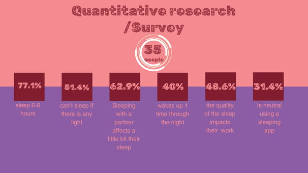
Quantitative Research - Survey
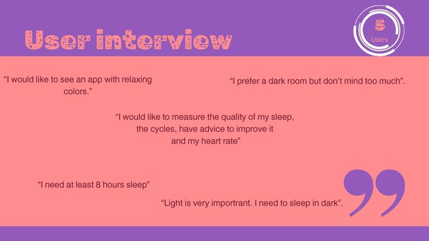
Qualitative Research - User Interviews
We conducted five user interviews to better understand users' sleep habits, frustrations, and their knowledge about the subject. These interviews provided valuable insights into their preferences and needs, shaping the direction of our design. These insights highlighted the importance of personalization, sleep tracking, and a visually calming interface, guiding our design choices to better support user needs.

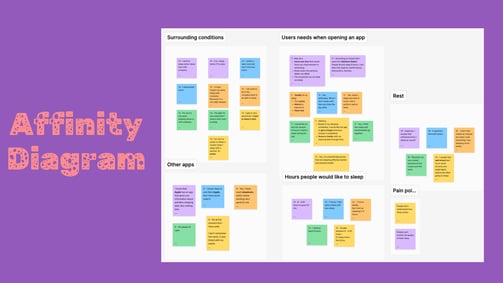
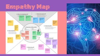
Affinity Diagram & Empathy Map
Now was the time to organize all the insights from our users. We did so using two tools: the Affinity Diagram and the Empathy Map. With the first, we grouped the insights into the following categories: Surrounding Conditions, Users' Needs When Opening an App, Rest, Other Apps, Hours People Would Like to Sleep, and Pain Points. With the second, we organized the insights to understand what users see, do, think, and feel—this helped us create the User Persona.


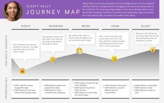
User Persona & User Journey Map
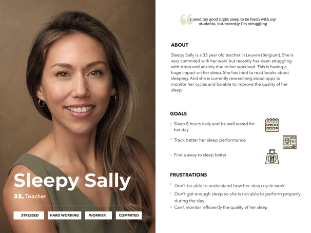
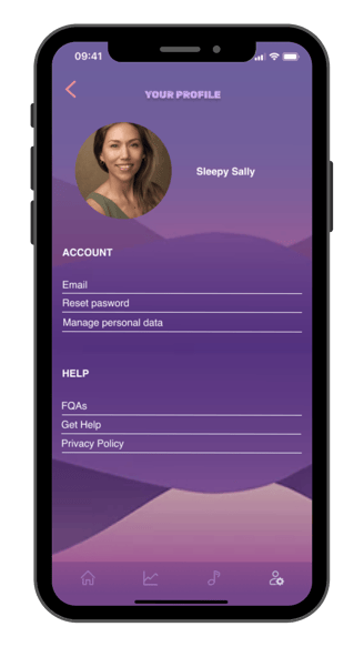
With all the gathered insights, we defined our User Persona: meet Sleepy Sally, a 33-year-old teacher living in Leuven, Belgium. She is very committed to her work but has recently been struggling with stress and anxiety due to her workload. This is having a huge impact on her sleep. She has tried reading books about sleep and is currently researching apps to monitor her cycles and improve her sleep quality.

To further empathize with our users, we mapped out Sleepy Sally’s journey. She spends her nights stressed about work and deadlines, which results in very light sleep and frequent awakenings. Because of this, she feels exhausted throughout the day, but when she gets home, she still can’t fall asleep right away as her mind is still occupied with work.

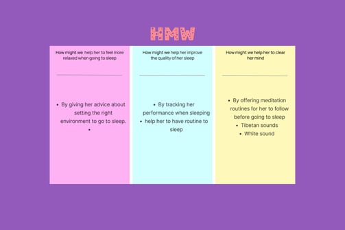
Problem Statement & HMW | How Might We Statements
After gathering insights, we moved on to the Define stage and formulated our Problem Statement:
Hard working people with sleeping problems need to find a way to improve the quality of their sleep because They are under stress and they can't perform well during their day.
With this in mind, we developed How Might We (HMW) Statements to guide our solution:
MoSCoW Method & MVP | Minimum Viable Product Statement
To define priorities effectively, we used the MoSCoW Method, a technique that classifies features based on their necessity. This approach allowed us to focus on core functionalities, ensuring that key elements such as:
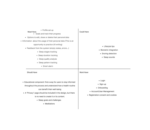

These priorities shaped our Minimum Viable Product (MVP), ensuring that the platform delivers value while allowing room for future enhancements.
Cosmic Sleep MVP is designed to provide accurate sleep monitoring and educate users about sleep. We observed that some existing apps fail to meet user expectations, particularly in terms of data accuracy and sleep-related information. This lack of reliability leads users to abandon sleep tracker apps altogether.
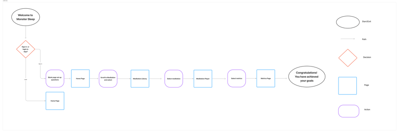
User Flow
For the User Flow, we designed an intuitive Happy Path that guides users seamlessly through the app, minimizing friction and enhancing their overall experience.
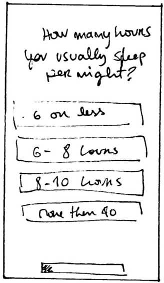
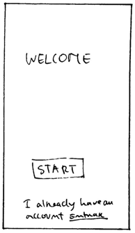
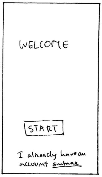
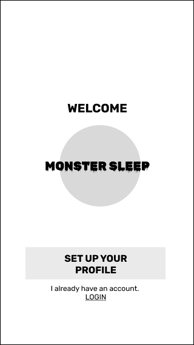
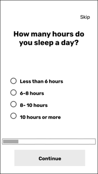
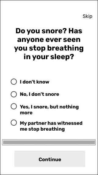
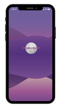
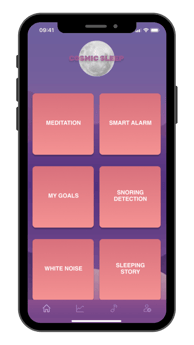
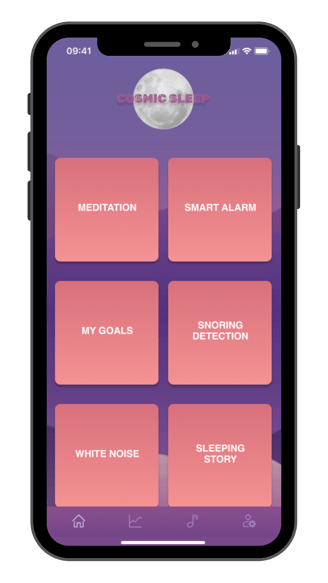
Sleepy Sally have just download a new app the flow starts with Welcome to Cosmic Sleep screen,. New users proceed through a setup process with onboarding questions to personalize their experience, while returning users are directed straight to the Home Page.
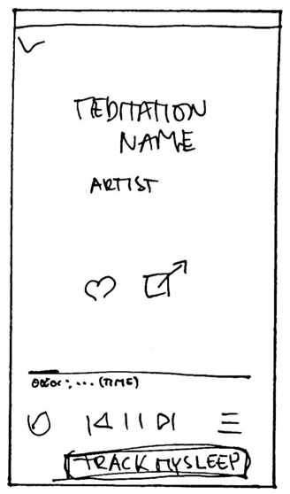
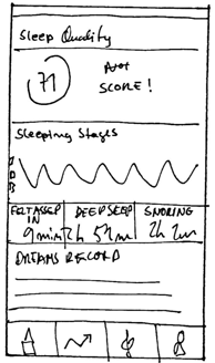
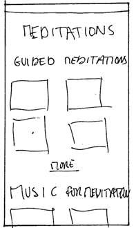
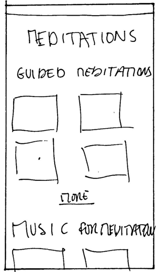
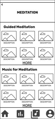
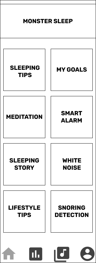
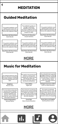
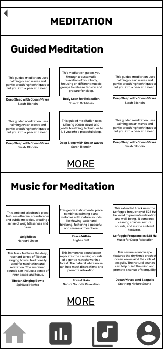
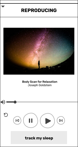
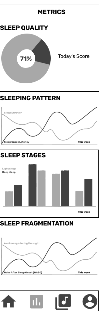
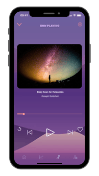
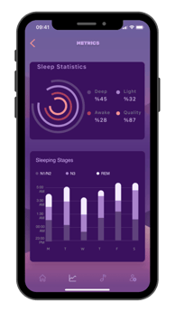
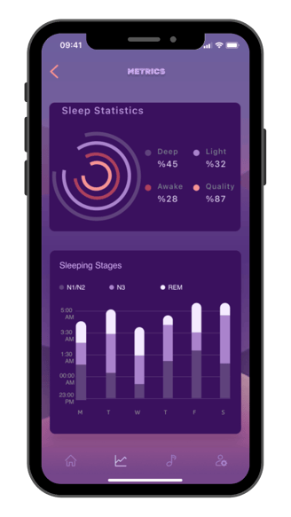
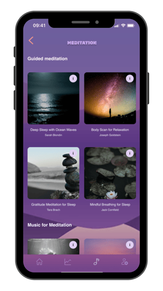
From the Home Page, users can scroll through meditation options and select one from the Meditation Library. After choosing, they are taken to the Meditation Player, where they can start their session. Once completed, users are guided to the Metrics Page, where they can visualize their sleep data and track their progress.
This structured flow ensures a smooth, goal-oriented user journey, making sleep tracking and meditation easily accessible and enjoyable.
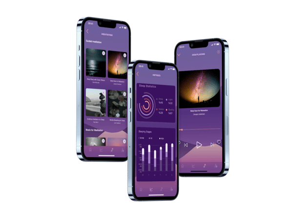
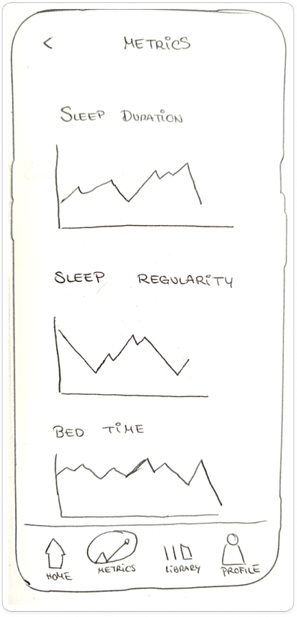
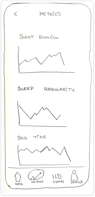
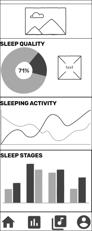
Dashboard Design
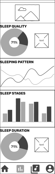
We explored different graphic representations and visualization techniques to display user metrics effectively. Our goal was to create a clear, engaging, and intuitive dashboard that allows users to easily interpret their sleep data.

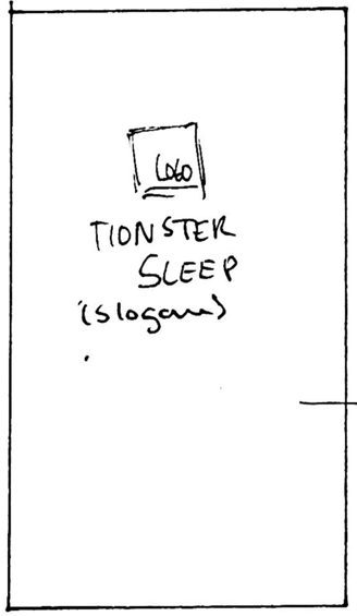
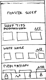
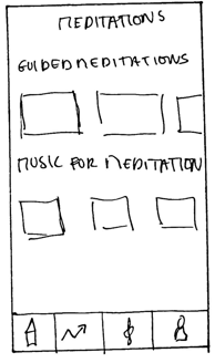
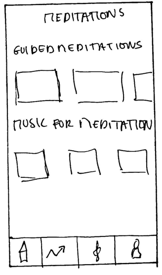
Concept Sketches
At this stage, we began ideating and exploring different approaches to improve the website’s user experience. We created hand-drawn sketches to explore possible solutions that would address the usability issues identified during research. These sketches helped visualize initial ideas and set the direction for the next phases of prototyping.
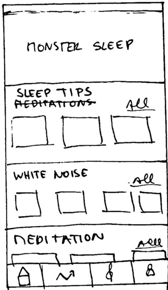

Concept Wireframes & Testing
After creating the hand-drawn sketches, we moved on to creating wireframes in Figma, where we refined the design and began testing with users. During the tests, we gathered valuable feedback that helped us improve usability and the overall flow of the experience.
Here are some key insights:
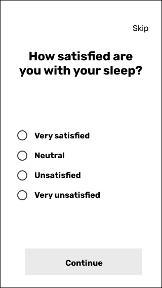
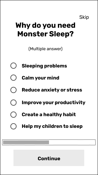
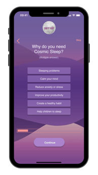
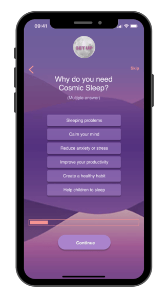
Clarification of instructions: "Maybe adding a small text in the question screens saying something like: ‘Please select only 1 option’ or ‘You can select more than 1 option.’" – Users felt it wasn’t clear if multiple options could be selected.
Connection with user goals: "You could connect the information extracted from the onboarding questions with the user goals, or even generate a fun profile based on that."
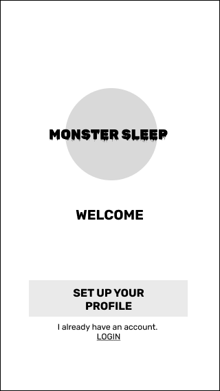
Visibility of the app name: "I think it would be good to make the app name stand out more."
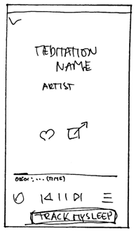
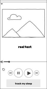
Simplification of interactions: "I would just have one button for play and pause."
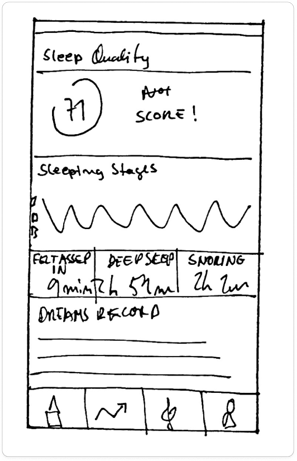
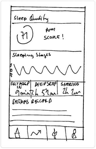
Usefulness of the graphs: "I find the graphs very helpful."
Personalization in the dashboard: "In the dashboard, I’d love to see something like ‘Hello [Username]! Here’s the latest info from your sleep stats last night!’ and something like ‘You could do better next night.’"
These insights helped us refine the design to create a more intuitive and engaging user experience.


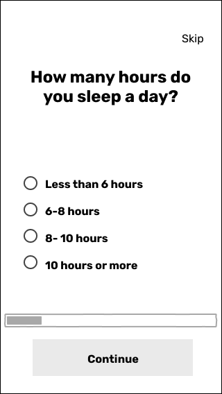
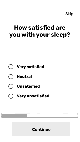
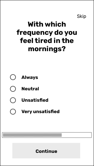
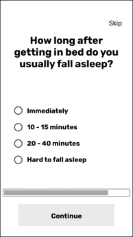
Low-fidelity Wireframes & Usability Testing
After ideating, we moved on to prototyping, merging our ideas into a more structured solution. Based on the insights gathered from our previous testing phase, we implemented key improvements to enhance clarity and usability. These adjustments included refining the onboarding process by adding instructional text to question panels, ensuring users understand how to interact with multiple-choice options.
We improved the Meditation Player by simplifying the controls, consolidating play and pause into a single button for a more intuitive experience.
These refinements ensured that our low-fidelity wireframes effectively addressed usability concerns while maintaining a clear and engaging user flow.


Mid-fidelity Wireframes & Usability Testing
After ideating, we moved on to prototyping, merging our ideas into a more structured solution. Based on the insights gathered from our previous testing phase, we implemented key improvements to enhance clarity and usability. These adjustments included refining the onboarding process by adding instructional text to question panels, ensuring users understand how to interact with multiple-choice options.
We improved the Meditation Player by simplifying the controls, consolidating play and pause into a single button for a more intuitive experience.
These refinements ensured that our low-fidelity wireframes effectively addressed usability concerns while maintaining a clear and engaging user flow.
To further empathize with users, we conducted a Visual Competitive Analysis, looking at three competitors in our market space: Sleep, Sleep Cycle, and ShutEye.
This helped us understand how their websites are designed, what visual elements they prioritize, and how they communicate their brand identity. More importantly, it allowed us to define how we wanted our product to stand out, ensuring a distinct and engaging visual identity that reinforces our brand values.


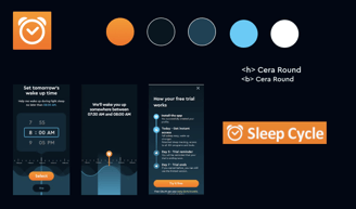

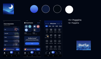
Visual Competitive Analysis
Brand Attributes & Moodboard
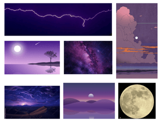
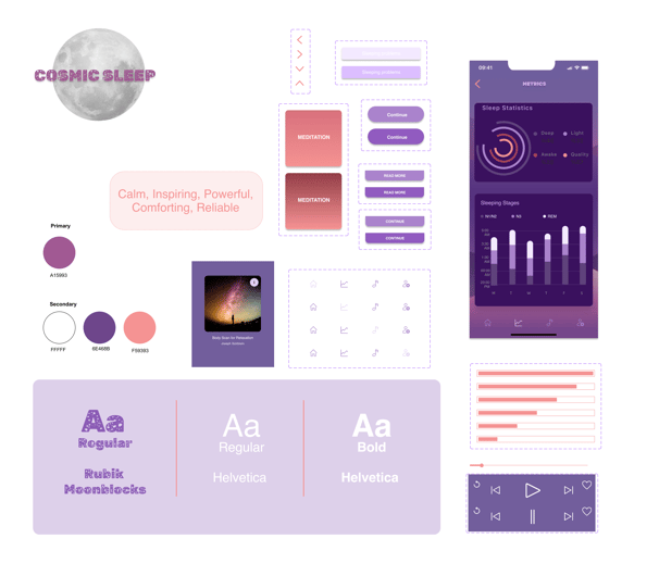
To establish a strong and cohesive brand identity for Cosmic Sleep, we began by defining the core attributes that would guide the design process: Relaxing, Spacious, Friendly, Comforting, and Laid-back. These attributes reflect the values and essence we wanted the app to convey, ensuring a consistent user experience aligned with the brand's mission to improve well-being.
Guided by these qualities, we created a moodboard incorporating calming purples, tranquil landscapes, and celestial imagery. This collection evokes a sense of peace and wonder while highlighting the restorative power of sleep. The visuals were chosen to instill a sense of calm and serenity, reflecting the emotional journey the app aims to offer its users.
We then tested the Moodboard with various keywords to refine the visual identity further. Through user feedback, we discovered that the brand was best represented by the following set of attributes: Calm, Inspiring, Powerful, Comforting, and Reliable.
These refined attributes guided the development of Cosmic Sleep’s visual language, ensuring that it communicated the app's core mission while resonating with users on an emotional level. This approach ensures that the brand identity is not only appealing but also deeply connected to the app’s purpose—helping users improve their sleep and overall well-being.

Style Tile
In the style tile, we established the key colors, fonts, and interface elements that define our brand’s visual identity. The purples and warm pink color scheme were inspired by the moodboard, reinforcing attributes like calmness, comfort, and a sense of power. These colors aim to create a soothing, inviting experience while providing an underlying strength, aligned with the app’s mission of improving well-being.
For typography, we selected Rubik-Moon Rocks, an original design based on the GoogleFont Rubik by Hubert & Fischer, Meir Sadan, and Cyreal. This typeface captures a modern yet approachable vibe, perfect for digital interfaces. It was chosen for the app’s name in the logo and titles, giving a distinctive, memorable presence.
Additionally, we incorporated Helvetica, a font that became synonymous with the Swiss Style movement (International Typographic Style). Known for its simplicity, readability, and objectivity, Helvetica’s clean lines and balanced proportions reflect the brand’s ethos of clarity and precision. It is used for the app’s text, buttons, and other interface elements, ensuring consistency and legibility across the user experience.

High-fidelity Wireframes & Testing
Building upon the Style Tile, we developed a preliminary vision of how the visual elements would work together. These ideas were then translated into high-fidelity wireframes, bringing the brand identity to life while maintaining the structure established in the mid-fidelity stage.
Additionally, we conducted usability tests at this stage. However, due to time constraints, we were unable to implement the gathered insights.


Conclusion & Learnings
The next steps in refining the product would include:
Implementing the gathered feedback
Conducting desirability testing
Refining the design based on new insights
Repeating the testing process
Moving forward with development.